You have undoubtedly seen many tutorial sites showing off how to implement the newest whiz-bang features of modern JavaScript libraries. While most of these sites do an adequate job of showing users "how to" implement features, they almost always neglect teaching when to use these techniques, and more importantly, when to forego them.
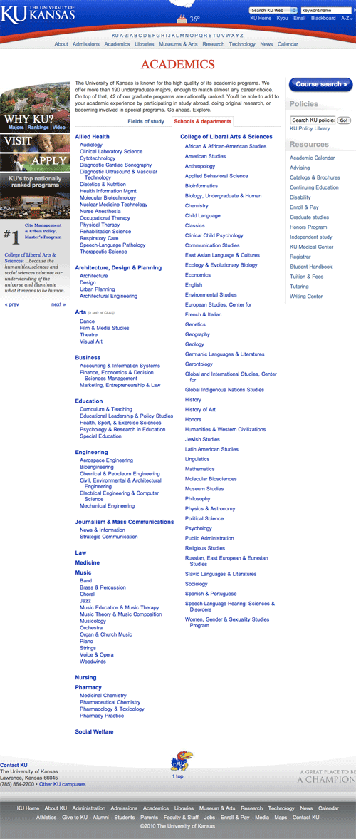
At the University of Kansas where I currently do web development work at the time of this writing, we recently had a random student developer from another large University call our help desk and suggest we implement a collapsable content list (an accordion) on our Academic Schools & Departments page (seen below.)

Even though the content is in a list format with headings over each area, I chose not to use an accordion. Why not? Let's consider a few things.
How did the user arrive at this page?
Looking at our Google Analytics numbers, about 99% of visits to the Academics page come from the KU's homepage and primary site pages. A link to "Academics" lives in the top-navigation, so it's very visible. This indicates the user is already browsing around our primary site, where they find general info about the University.
This particular page is also the 3rd-most visited page on KU's main website, only behind the Homepage and A-Z's "E" page (where users go to click on "Email.") So it's seeing a lot of traffic.
How many clicks deep is this page? What other pages might the user have encountered before arriving at this page?
This page is one click deep at all times. A user can access this page with one click from almost any other page on KU's website, so its content should be geared to hit a wide audience with a variety of expectations.
What is the context of this page?
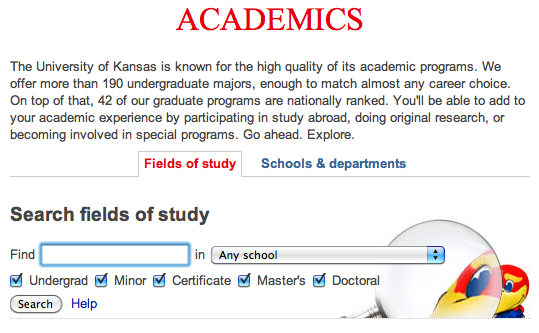
In this case, the Search tab is active when the user first arrives. Users are accustomed to (and often prefer) searching to find the content they want, so we let them Search first. Search provides instant gratification and is a low time investment opposed to reading a long page of text or links.

We also operate under the assumption that after a user finds the information they seek, they stop looking. If search meets their needs, they will not likely encounter our list of Schools & Departments.
So what can we conclude about the context of this page and the user arriving there?
- The user is looking for info about the schools and departments KU offers.
- Since the user was first provided a Search box, they likely already searched for the info they wanted and their needs were not met.
- They may or may not know the name of the department they're looking for and…
- want to see a hierarchy of schools and departments
- want to see all options and pick the one that best matches what they're looking for
Now that we've asked given context to the page visitors, let's pick up where most tutorials start: the content being presented.
What type of content is this?
Our very long list is broken down in a hierarchy by School, then Department. If we took into account only the hierarchy and length, a collapsed list would absolutely solve that problem. But let's go beyond content tutorials and dig a bit deeper.
Does the user need to see all content at once?
In this case, yes, they likely do. The user didn't find what they wanted using the search, and they want to see all possible options to find the one that best matches what they're looking for.
Remember, this user might not know what they're looking for because this page is not very deep in the navigation structure. So rather than hide a bunch of content from the user, we give it to them all at once. They can use CTRL + F to search the page content for a specific department, or quickly skim over each school and through the department lists.
Conclusion
These are all questions you should ask yourself before implementing any type of visual effect or design element. You might think you're being clever, but you could just as easily be hurting the usability of your site's content.
comments powered by Disqus